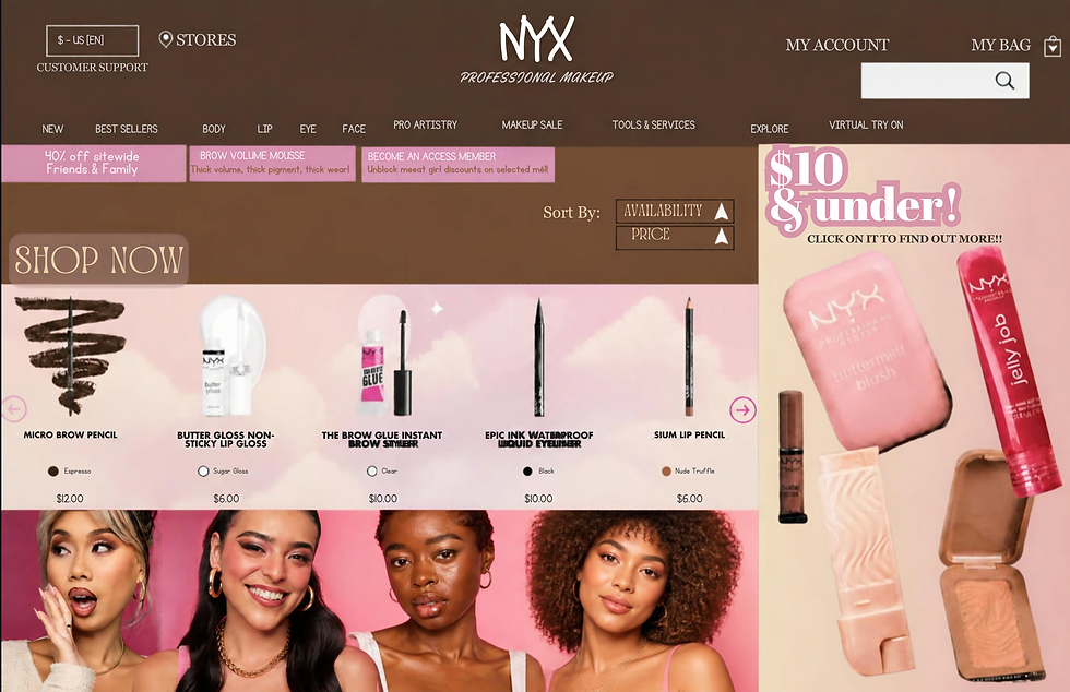
Reimagining ChatGPT: A Creative and User-Friendly Interface
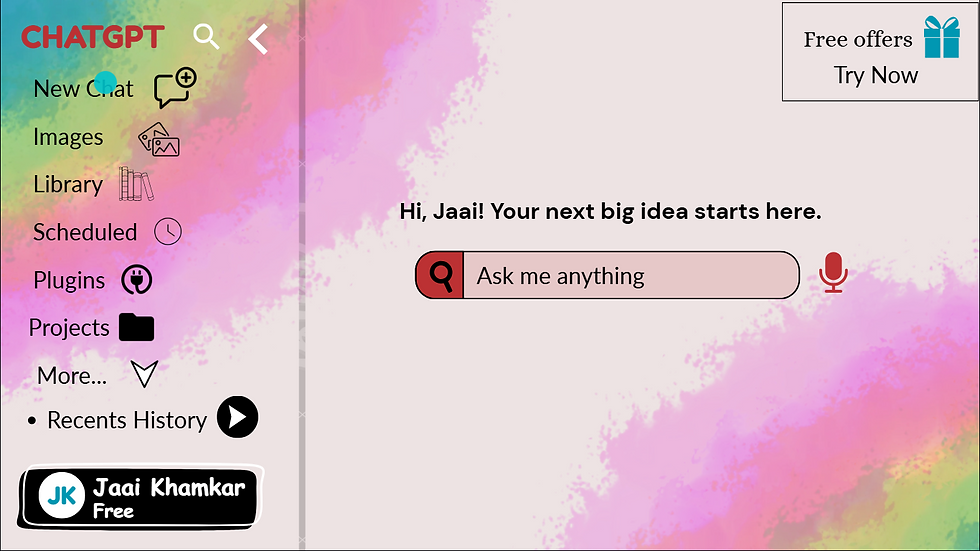
My design was inspired by the idea of making ChatGPT feel friendly, creative, and welcoming, rather than looking like a purely technical platform. I wanted the homepage to communicate that ChatGPT can be used for many different ideas and activities, while still being easy to navigate. The colourful background represents creativity and different possibilities, while the simple interface keeps the design practical.
For typography, I used Lato, Fredoka, DM Sans, Alice, and Comic Sans for different purposes. I chose Fredoka for the main greeting because its rounded and friendly appearance makes the homepage feel approachable. Lato and DM Sans were used for interface text because they are clean and easy to read. Alice adds a slightly more traditional and elegant feeling to the promotional section, while Comic Sans gives the profile area a more casual and personal character. I varied the font sizes and weights so that important information, such as the greeting and search bar, receives more attention.
The layout follows a clear left-to-right structure. The sidebar is positioned on the left so that navigation options remain grouped together, while the main content occupies most of the screen. I also used spacing to prevent the different sections from feeling crowded. The search bar is placed near the centre because it is the main action I want the viewer to notice.
Colour was an important part of my design. I used pink, purple, blue, green, and yellow in the background because these colours create an energetic and creative atmosphere. The contrast between the colourful background and the lighter central area helps the important interface elements stand out. I also used blue for selected icons and red for the ChatGPT title and microphone to create visual emphasis.
My main goal was to create a clear visual hierarchy: first the greeting and search bar, then the navigation and promotional offer, followed by the profile area. I want viewers to feel that the interface is creative, welcoming, and easy to explore.