Redesigning NYX Professional Makeup: A Study in Colour, Typography and Visual Hierarchy

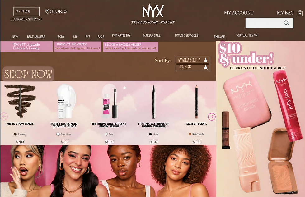
For my website redesign, I chose NYX Professional Makeup because I wanted to work with a brand that already has a bold and creative personality. My goal was to keep the fun and youthful feeling of NYX, but make the homepage look more organised and easier to navigate. I wanted it to feel exciting without having too many things competing for attention.
For the typography, I used a mix of decorative and simpler fonts. I wanted the main headings to stand out and give the website more of a fashion and beauty magazine feel. For smaller information like product names, prices and navigation, I chose simpler fonts so that everything would still be easy to read. I also changed the sizes and styles of the text to make it clear what information was more important.
I used a structured layout with different sections so that the page felt organised. I kept the navigation at the top and then placed the promotional content, products and images below it. I also aligned the products consistently so the page would feel cleaner and easier to look through.
For my colours, I chose brown, pink, cream and white. I wanted to keep pink because it connects strongly with makeup and the playful side of NYX, while the brown adds a warmer and more sophisticated feel. The cream and white help balance the brighter colours and stop the page from looking too crowded.
I also focused on visual hierarchy so that the viewer’s attention moves naturally around the page. The logo and navigation come first, followed by the main “SHOP NOW” section, featured products and promotional content. Overall, I wanted the redesign to make people feel excited and curious about the products, while showing that NYX is a creative, modern and inclusive makeup brand.