Redesigning Iba Cosmetics Website


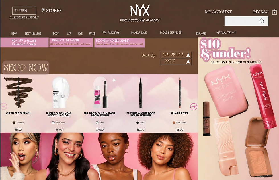
My design was inspired by the Iba Cosmetics website because I liked the page layout on their website. They have an elegant, feminine look, bright colors, and the products they sell are presented in such a way that it is immediately visible what cosmetics the company is offering. I tried to make my page modern and attractive, highlighting the products so that it is easy to understand what they are.
I decided to choose the sans-serif type of text to create a cosmetic website page because it looks elegant and feminine. At the same time, it was necessary to make the product name more prominent than the other text. That is why I used the bigger font size and the bold text effect on the headline. I made the other text smaller so that it does not compete with the product name. I also organized the navigation block so that it could hold the top part of the page, highlighting the product without overshadowing it.
I tried to create a sense of balance on my website by making the product the center of the page and the other blocks around it. I arranged cards in a row so that it was convenient for the user to perceive the available products. I made each card similar in size so that it looks uniform. I placed the navigation bar at the top of the page in one row with the title and search bar so that it is easier for website visitors to find what they are looking for.
I decided to use the pink color scheme for the website because pink is a feminine, elegant and romantic color. The use of pink as the color of the website seems appropriate to me, given the beauty and cosmetics of the company. I tried to combine it with white to make the website look airier and more modern. In addition, I decided to use pastel shades of colors in square blocks as an accent for each card with a product. This made the website more attractive to the eye.
I organized the page so that you could first of all notice the product photo, the product name, the navigation bar, and the relatively smaller size of the text with other information about the product. I added heart icons to the cards so that users could understand that they can put the product in the Wishlist by clicking on them. In general, I tried to make the website look elegant and feminine but at the same time modern and comfortable so that it was easy to find the product they were looking for.